
Visual Explanations
Images and Quantities, Evidence and Narrative
by Edward Tufte
Last tended to July 04, 2020
Tufte has written multiple books, so it's hard to know which to pick up. In his own descriptions:
- The Visual Design of Quantitative Information is about depicting numbers
- Envisioning Information is about depicting nouns, and includes design strategies like colour, layerings, and interaction
- Visual Explanations is about depicting verbs - representing motion, process, dynamics, cause, effect, explanation, and narrative.
Tufte sets out to teach us a series of design strategies - "the proper arrangement in space and time of images, words, and numbers - for presenting information about motion, process, mechanism, cause and effect"(9)
Good visual explanations show the qualities and functions of concepts, relationships between concepts, and events that occur around them
At the core of Visual Explanation is showing relationships between concepts, and events that happen between them. I personally like to simplify these to nouns and verbs. This includes what causes those events, and what effects those events have.
Opens with a beautiful quote from Emile Durkheim from The Elementary Forms of Religious Life:
"Categories such as time, space, cause, and number represent the most general relations which exist between things; surpassing all our other ideas in extension, they dominate all the details of our intellectual life. If humankind did not agree upon these essential ideas at every moment, if they did not have the same conception of time, space, cause, and number, all contact between their minds would be impossible..."
Historical Examples of Visual Explanations
Visual explanation is not new. Tufte points to a number of good examples that all "demonstrate methods to represent, describe, illustrated, and indeed, construct knowledge"

In 1633 Robert Burton published The Anatomy of Melancholy - A heavily illustrated medical textbook about melancholy
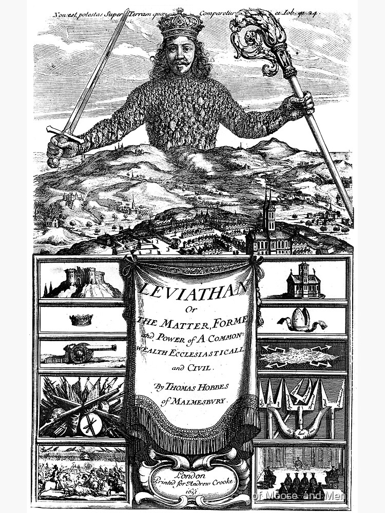
Similarly, in Thomas Hobbes's Leviathan hammered down on his political opinions and insist on his pessimistically dire account of human nature as "nasty, brutish, and short"

Richard Feynman's space-time diagrams of quantum electrodynamics
"Clarity and excellence in thinking is very much like clarity and excellence in the display of data" ... "The act of arranging information becomes an act of insight"
These Design Strategies arrange images as a narrative in a way that is more "lyrical" than quantitative. We want to make designs that "enhance the richness, complexity, resolution, dimensionality, and clarity of the content"
"By extending the visual capacities of paper, video, and computer screen, we are able to extend the visual capacities of paper" (10)
We use three kinds of visual language to show quantities
1. Direct Labels
Numbers on statistical grids and charts. The label and the element should be tightly mapped so the connection is obvious.
2. Encodings
Where meaning is encoded from one form of data into another, such as showing temperature change through colour mappings. Tufte sees these as an "impediments" to understanding (in comparison to direct labels)
3. Self-representing Scales
Physical objects of known size. We know the rough height and width of trees, cars, and sidewalks, and can use them as scale markers.
Maps use two-dimensional "addresses" (X, Y, co-ordinates) to create "miniature pictorial representations of the physical world."
- Early maps used north-south-east-west co-ordinates. It took us 5,000 years of map-making to develop X and Y.
- This runs parallel to our evolution with perspective - cave wall paintings to the linear perspective calculations of The Renaissance perspective, to Cubism perspective, and eventually abandoning everything with modern abstract art.
- "The two-dimensions of the canvas no longer referred to world scenery but only to themselves" (15)
It's clear Tufte has a deep love for scales and labels to help give us context and precision.
Scientific visualisations often lack basic context; how big is this thing? What direction is it moving in? What are the dimensions of this scene?
Argues the current Metaphors in scientific visualisations are stages, lights, cameras, films, cartoons, and television. These sometimes distort and exaggerate the information to create dramatic depictions. Instead people should think in maps and statistical graphics.
Visual explanations of magic tricks are ideal case studies for how to document and explain a process - to "make verbs visisble". They show step-by-step sequences of performances - "a four dimensional story, using words and images to navigate through time" 55